

Overview
App Store maintains a strict policy and guidelines for the app screenshots displayed for various apps on the app store. Breaking any of those rules and guidelines may lead to rejection of your app store screenshots. Here are things you should know when creating store screenshots before you submit them for review to avoid rejections.
1. 60/40 Rule for App Preview in Screenshots
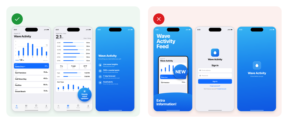
According to App Store Guideline 2.3.3, more than 50% of your store screenshots should show your app UI. Rest of the screenshots can be utilized for creative purposes where it’s optional to show app UI.
Apple had this guideline since a long time ago, and not following these rules was often fine. But recently, Apple has started rejecting store screenshots that don’t follow these guidelines. Make sure you follow these guidelines to avoid getting your store screenshots rejected.
2. No third-party promotion in the screenshot
Do not show, reference or mention any third-party apps/platforms logos/content in your store screenshots. App Store is strictly against these designs.
Source: Guideline 2.3.10
3. No false claims in screenshots
Avoid adding any claims within your store screenshots that you can’t back up with valid proofs. Many people tend to add claims such as “No.1 app in X Category”, “Apple Design Awards Winner”, “1000+ reviews”, “Used by X number of people”, and so on. Adding such false claims may lead to rejection of your app, or even termination of your Apple developer account.
Source: Guideline 2.3.1 and App Store asset best practices.
4. Apple related recognitions
Don’t include any Apple related recognitions - such as Editor’s Choice, App of the Day, Game of the Day, or Apple Design Award winner in your store screenshots. If your app has received those, then they may already appear alongside your app or game in search results, as well as on your product page.
Source: Guideline 5.2.4.
5. Apple Product Frames
Under the guideline 5.2.5, Apple mentions to avoid using Apple products device frames in store screenshots. But this guideline isn’t strictly enforced. And isn’t an issue.
Although, in your app logo, avoid using Apple product frames as it may lead to rejection under this same guideline. I’ve encountered this rejection one or two times, so would recommend you avoid this as well when it comes to your app’s logo.
6. Do not impersonate other apps
Under guideline 4.1, Apple has started rejecting store screenshots or directly terminating app store accounts of the developers who try to impersonate other apps in their store screenshots. You can take inspiration from other apps store screenshots but make sure they are not 1-1 copy of the store screenshots, and your designs don’t fall under guideline 4.1.
7. Don’t include pricing/discount details
To keep store screenshots accessible, and eligible for all the App Store users around the world, Apple prohibits mentioning any pricing, discount, copyrighted, events details in your store screenshots.
Source: Guideline 2.3.7
8. Copyrighted material
The material or assets you use to create your store screenshots should not be copyrighted or infringing on someone else’s trademark. Make sure you own them or those assets are under public domain or a Creative Commons license for public/commercial use.
Source: Guideline 2.3.9 and Guideline 5.2.1.
9. Readable text
Text across your store screenshots should be readable from a standard mobile viewing distance. Make sure it’s not too small such that users will have hard time reading it within the search results screenshot tile which is usually displayed at a smaller scale compared to screenshots tile within the product page.
Fonts you use across your text also matter. Do not use hard to read fonts. Stick to either Roboto, Inter, Asap, Serif, Grotesque or other fonts which are easier on the eyes. Fonts you use also can change the tone of your messaging to the user. Picking a good font is important here to clearly convery your messaging to the viewer.
10. Lead with your best three screenshots
Most people decide on your app from the first few screenshot. In StoreMaven’s 2019 study of product pages without a video, the share of visitors who saw each screenshot in full dropped off sharply after the first one:
Share of visitors who see each screenshot in full. Source: StoreMaven, 2019.
The same research found that 60% of visitors never scroll past that first impression, and half of installers decide on it alone. So the first few screenshots carry most of the weight.
Put your best three screenshots first in your screenshots order. In search results, your first three screenshots are displayed. And majority of people on App Store make the decision of downloading an app based on the first three screenshots.
What you show and say in those first three screenshots is more important now than ever.
11. Lead with benefits
When conveying a message or story through your store screenshots, always lead with benefits instead of features. This helps pinpoint the problem users face, and for which they’re looking for a solution. Apple also recommends focusing each screenshot on a main benefit or feature.
If you can make it clear, how your app can benefit the user in simple terms, then you’ve already won them.
Source: Apple: Creating your product page.
12. Focus on showing core experience of the app
Keep your store screenshots simple but yet designed around your app’s experience. Do not crowd your screenshots with things user doesn’t need to know or are of less importance. You can utilize that space for showcasing something more valuable or bringing points that help user make a decision around downloading your app.
Conclusion:
Remember to follow these guidelines when designing your app store screenshots to avoid store review rejections.